Cafker Website

I designed a new website for Cafker, a videomaking company, while freelancing for the studio. The brief was straightforward but important: replace an outdated site with something clean, credible, and built to let the work speak for itself. The goal was a site that felt current, made the showreel and portfolio the centrepiece, and gave potential clients a clear, frictionless way to understand what Cafker does and get in touch.
Click here to visit the website
Type:
Company website (freelance client project)
Role:
Website designer and developer
Skills:
Web design · Wireframing · Content structuring · Visual design · Video editing

The first step was understanding what the old site was failing to do. Cafker's work is visual and reel-led, so the previous site's structure was getting in the way rather than helping: too much friction between landing on the homepage and actually seeing the work. I focused the scope on a simpler goal, get visitors to the showreel and portfolio fast, and present services and contact information clearly around it, without competing for attention.

Structure &
Information Architecture
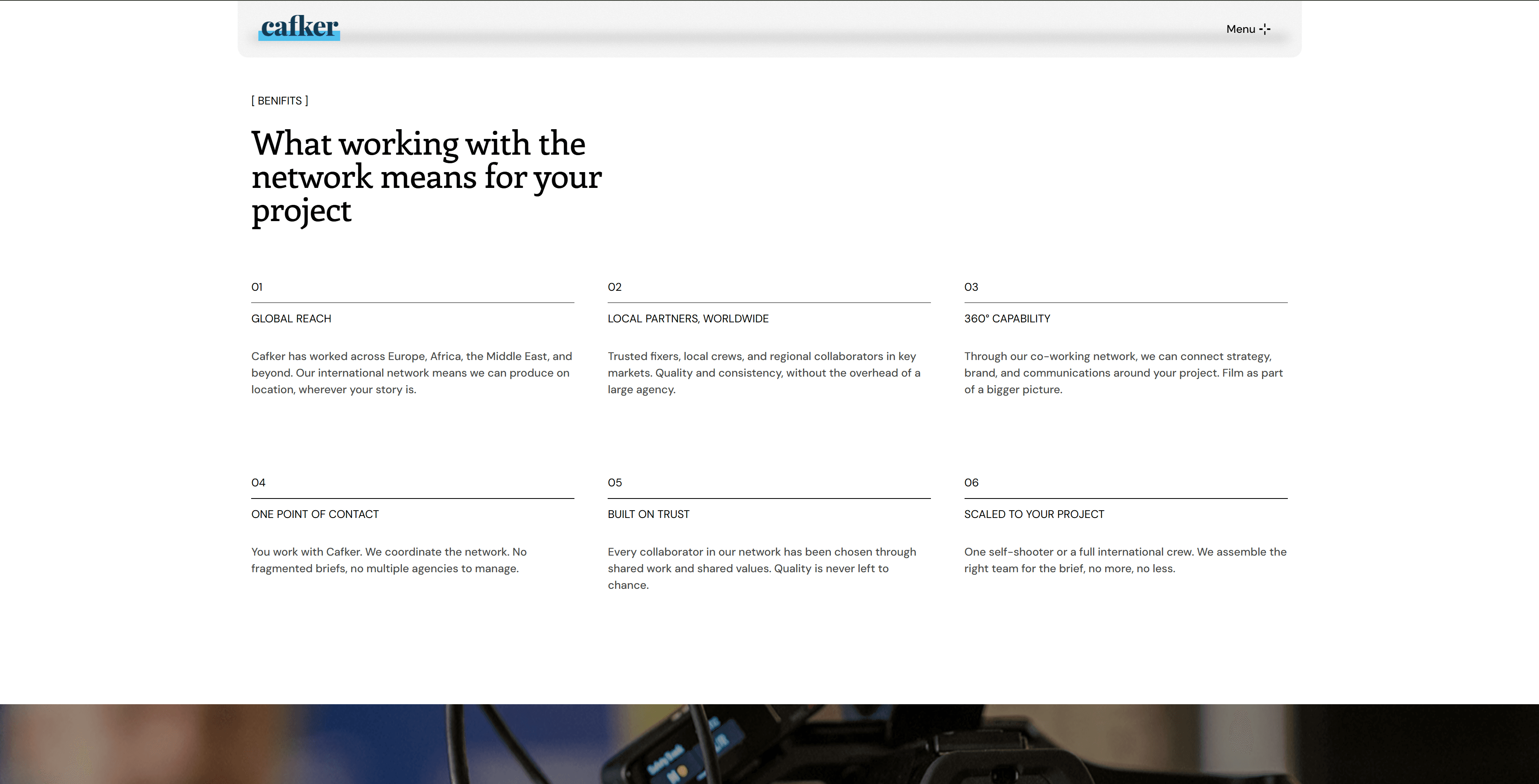
I mapped the site around a small number of clear sections: Home, Showreel, Portfolio/Work, Services, and Contact, keeping the path from landing to watching work as short as possible. To support the portfolio at scale, I built a CMS template for individual project pages, so each of Cafker's 19 projects could be added and updated consistently without needing a custom-built page every time. Each page follows the same visual-first structure, leading with the work and keeping supporting copy secondary.


Visually, the site needed to feel professional without distracting from the video content itself. I kept the interface minimal, dark or neutral backgrounds, generous whitespace, and typography that stayed out of the way, so that thumbnails, reels, and stills carried the visual weight. For the selected work section on the homepage, I experimented with interactive 3D elements, giving the featured projects a more tactile, engaging presence than a standard static grid. Motion and transitions elsewhere were kept subtle, letting the moving work itself do most of the talking.


Content & Showreel
The showreel sits front and centre on the homepage. I cut it myself from footage the client provided, selecting and pacing the clips to work as a fast, front-loaded highlight reel rather than a long-form portfolio piece, since it's often the first and only thing a visitor watches before deciding to explore further. Supporting portfolio pages are organised so visitors can browse by project or by type of work, and copy across the site was kept short and benefit-led rather than competing with the visuals.


This project was a good exercise in restraint, knowing when to let content lead and design step back. For a studio whose work is inherently visual, the website's job was to get out of the way as quickly and cleanly as possible.