MuseFeed
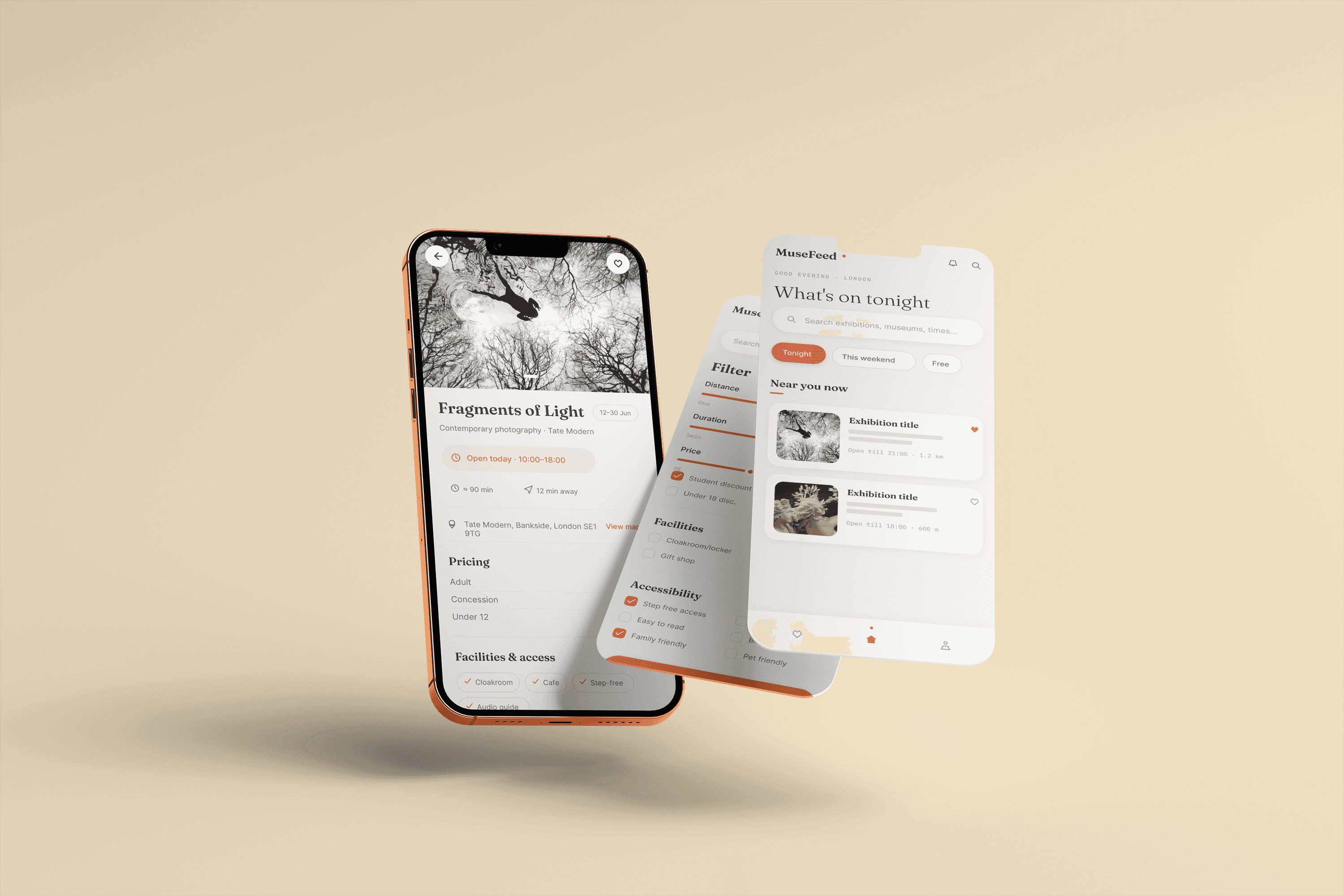
MuseFeed is a UX case study exploring how people with tight or unpredictable schedules can turn a spare hour into a confident museum visit. I worked end-to-end across research, ideation, wireframing, and prototyping in Figma, then tested and iterated the design across two rounds of usability testing.
Tools:
Figma · FigJam
Skills:
User research · Persona development · Journey mapping · Competitive audit · Information architecture · Wireframing · Prototyping · Usability testing

How it started
As an art lover living in London, I wanted to look at museum visits through the lens of people who don’t have the luxury of planning ahead like myself: students, shift workers, caregivers, and anyone whose free time shows up unpredictably. Existing museum apps and websites tend to assume the opposite, that visitors know their plans in advance, which leaves this group underserved. I set myself the following problem statement: “How might we help busy, access-conscious museum-goers turn unpredictable pockets of free time into confident visits?” This is how I arrived at MuseFeed, an app that surfaces what’s on right now, shows live availability, and gets users from discovery to a booked ticket in a few taps.
Understanding the user
I ran primary and secondary research into how people who enjoy museums actually plan visits, including interviews, a journey-mapping exercise, a short survey, and a competitive audit of Tiqets, Tate, TuriTop, and Tessitura. The findings overturned my initial assumptions: users didn’t need more inspiration, they needed speed and certainty, particularly around live availability and trustworthy accessibility information. From this I built two personas, Samira, a journalist and caregiver squeezing visits into narrow windows of free time, and Jordan, a healthcare worker on rotating shifts, and mapped Samira’s full journey from checking her calendar through to sharing her visit afterwards. This surfaced recurring pain points: unpredictable schedules, scattered information, and uncertainty about accessibility.

Wireframing
With a How Might We statement to guide me, I ran a Crazy 8 sketching sprint and a storyboard to explore concepts quickly, before mapping the full user flow and information architecture around five pillars: Browse, Profile, Search, Saved, and Notifications. I then moved from paper wireframes into low-fidelity digital wireframes covering the core journey: browsing or searching, filtering by distance, duration, price, and accessibility, reviewing an exhibition’s essentials, and booking a timed slot through to checkout.


Designing the UI
Once the flow was validated, I built the high-fidelity UI in Figma. Key screens include a home feed surfacing what’s on tonight, a filterable search and results view, an exhibition detail screen combining pricing, facilities, and accessibility in one place, a live availability and ticket-selection screen, and a checkout and confirmation flow.
The UI was designed to keep essential visit information close to the decision point, so users could move from browsing to a confirmed visit without having to chase information across different screens.


Testing and iterating
I tested the low-fidelity prototype with participants matched to my key user segments, including people with unpredictable schedules and users with dyslexia or screen-reader experience. This round surfaced a clear pattern: users expected accessibility status to be visible while browsing, not buried inside each listing, and greyed-out time slots left people uncertain whether something was sold out or simply closed. I iterated the design accordingly and ran a second round of moderated testing on the higher-fidelity flow. This confirmed the fixes were working and surfaced further refinements, so I added accessibility badges directly to exhibition cards, gave accessibility-related facilities distinct styling from general amenities, restyled unavailable time slots so they couldn’t be mistaken for open ones, and added Add to Wallet and Add to Calendar actions to the confirmation screen after participants repeatedly said a booking felt unfinished without one.


Final UI
The finished prototype collapses discovery, decision, and booking into a single accessible flow, with live availability, plain-language accessibility filtering, and one-place exhibition summaries at its core. This project deepened my understanding of running a full research-to-prototype UX process, from framing a problem statement through to validating and refining a design against real user behaviour.
